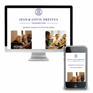
- Jean and Louis Dreyfus FoundationVisit JLDreyfus.org The Project The mission of the Jean and Louis Dreyfus Foundation is to enhance the quality of life of New Yorkers, particularly the aging and the disadvantaged. Their website did not convey the sophistication of the foundation or the organizations they fund. The main objectives of this project were to: 1. update the site with a simple but aesthetically pleasing way to showcase the programs supported by the foundation…
Read More - Service Program for Older People (SPOP)Visit SPOP.org About 20% of adults will experience a mental health disorder. SPOP (Service Program for Older People) knows that therapy can be a highly effective pathway to emotional well-being, offering therapy for people ages 55 and older. But the website was hard to use, especially for older adults. The Process Discovery Through our Discovery process, we identified three key constituencies; Clients; Those who will be participating in programs or their…
Read More - 42 Ed GamesVisit 42EdGames.com The Challenge Building on his years of experience Ray Kimball was taking his pedagogy to higher education professionals across the country with a completely new endeavor – 42 Ed Games. He needed soup to nuts; branding, messaging, and a website that would showcase the fact that that game-based learning is FUN. Designing immersive, highly engaging games that enable students to successfully grasp difficult concepts was his jam; marketing,…
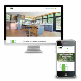
Read More - Mark Galezo and AssociatesVisit MarkGalezo.com The Challenge Mark Galezo, of Mark Galezo and Associates, reached out with questions about his website; he couldn’t figure out why he was not getting any traffic to his website. He had worked with a couple of other vendors but did not feel he had a clear picture of what they had done or where he stood. Nor did he feel he had a trusted resource to look…
Read More - Launch BoutiqueVisit – and shop – LaunchBoutique.com The Challenge Opening an online and brick-and-mortar store during a pandemic is not for the faint of heart! The client had a vision, however, and boldly moved forward. We needed to create an ecommerce website that would feature a limited number of products and categories to start but grow over time. The client would be adding products and maintaining inventory herself and wanted to…
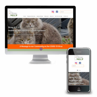
Read More - Stray H.E.L.P.Visit StrayHELP.org The Challenge Stray H.E.L.P.’s website lacked clear, concise messaging. Every page appeared in the main menu making it difficult to discern relative priority of information. Additionally, a number of technical issues made the site difficult to update and maintain on the backend and plagued the user experience on the front end. Solutions An in-depth marketing questionnaire provided an opportunity to reflect on key services the organization provides. The…
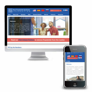
Read More - PFS FoundationVisit PFSFoundation.org The Challenge The PFS Foundation’s new website had been stalled for a while and communication with their web developer was sporadic. We were able to get the site launched but the work was not done! Content needed to be translated into multiple languages, and “wish list” features, such a a Patient Quilt of letters from PFS patients and family could be shared, were yet to be included. Solutions…
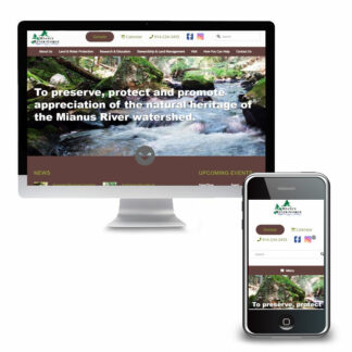
Read More - Mianus River GorgeVisit Mianus.org The Challenge Mianus River Gorge is a private, not-for-profit nature preserve and conservation organization; but you wouldn’t know it from their old website. The website mainly focused on the hiking trails and only a subset of the diverse programs and research being done. A previous malware infection left the site difficult to update. As a result, much of the content was old and the look and feel were…
Read More - Support Connection v2Visit SupportConnection.org The Challenge Westchester Marketing Cafe redesigned the Support Connection website over four years ago and while the page structure stood the test of time, the site was looking a bit dated. Online payments were also a challenge because the original theme did not play well with the payment gateway. As a result, online sponsorship payments and donations were problematic; a significant hurdle especially once COVID hit and virtually…
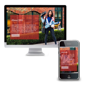
Read More - JessieJiang NYVisit JJNY.us The Challenge Jessie Jiang New York needed a portal to attract premium American brands to their Chinese shop on Alibaba. It needed to be slick and engaging, but fast loading for visitors who would mostly be accessing the site on their phones. The client found a paid theme that they really liked but had trouble converting the demo site to their content. The Solution We eliminated the slow-load…
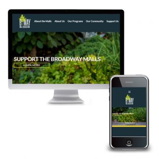
Read More - Broadway Mall AssociationVisit BroadwayMall.org The Challenge Broadway Mall Association had a WordPress website that they liked. A few technical and style issues, however, kept them from loving it. The home page slideshow was an integral part of their communication and design but was difficult to update. The widgets on the home page were attractive and quickly took visitors to key areas of the website. The photos, however, did not line up perfectly…
Read More - Michael StillerVisit MichaelStiller.com The Challenge The team at upLIGHT had a simple and elegant looking website. They still liked the design aesthetic even though the site had been designed a few years back. But the site was built without a Content Management System (CMS) and as a result, adding new projects to their portfolio required hiring a professional. Because of this updates to the website were often pushed to the back…
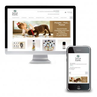
Read More - Sound EarthVisit SoundEarth.com The Challenge Sound Earth’s website was nearly 10 years old and its age was showing. As they moved into their busy season, and when what looked like a promising solution didn’t pan out, they needed an alternative fast. The small e-commerce business needed an online shopping experience that was easy for customers but also simple to manage on the backend. They didn’t need a lot of bells and whistles…
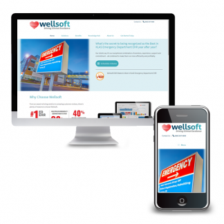
Read More - WellsoftThe Challenge Wellsoft.com was built on a relatively unknown Content Management System which was difficult to add new content and attract new prospects. With limited lead generation and lead capture forms it was challenging to identify and follow up with prospects. The non-mobile-friendly framework negatively impacted the site’s placement in the search engines and made it harder for visitors on mobile devices to engage with the site. Solutions We focused…
Read More - Balancing Life’s IssuesThe Challenge The Balancing Life’s Issues (BLI) website had become overgrown with too much copy and an on-boarding process that hadn’t been reevaluated in years. The BLI team needed to simplify and streamline the website to include only essential elements. Solutions The home page was designed to feature a company video that had been filmed previously but had no home on the old website. Contact information for staff was laid…
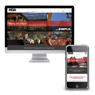
Read More - Miller Grossbard AdvisorsVisit MGALLP.com The Challenge Miller Grossbard Advisors, LLP (MGA) had been serving the Houston-area for decades. Their clients had grown to rely on them for much more than tax and accounting however. MGA needed their website to reflect not just their full range of advisory services but their unique personality. An ordinary website would not do. Solutions We worked with MGA to create a simple website with a very modern…
Read More - Accreditation GuruThe Challenge Three years after we merged Accreditation Guru’s old website and blog into a single platform, it was time to give the site a fresh look! The original design was fussy relative to the clean, pared-down aesthetic that had become popular. Solutions The website redesign built on the original style standards but focused on simplifying the look and the copy. This approach created consistency in branding between the old…
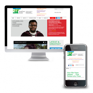
Read More - CoveCare CenterThe Challenge CoveCare Center, formerly known as Putnam Family & Community Services, needed a new website as a part of their rebranding initiative. More than just a new logo, they needed a website that would be mobile-friendly to accommodate their many clients accessing the site solely on mobile devices. The new site would start with a deep pool of content and grow from there. This made it crucial to create…
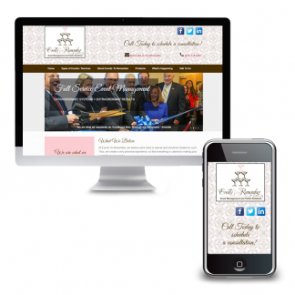
Read More - Events To RememberVisit EventsRemember.com The Challenge Events To Remember, a full-service event management agency, was growing. They added public relations to its list of services and were building on their reach with the nonprofit sector, working with development officers on large, gala-type events and fundraisers. Their site, however, was dated and because it lacked a content management system they were unable to easily update it. As a result, there was no mention…
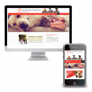
Read More - Humane Society of WestchesterVisit HumaneSocietyOfWestchester.org The Challenge The New Rochelle Humane Society was changing its name to Humane Society of Westchester at New Rochelle to better reflect all 19 communities they serve. They needed to rebrand and update their website as well. They already had a lot of great content on their website but lacked a way to highlight upcoming events. While users could make donations online, the process was confusing and cumbersome….
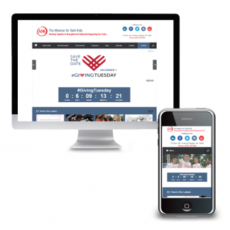
Read More - Alliance For Safe KidsVisit AllianceForSafeKids.org The Challenge The Alliance For Safe Kids, a nonprofit based in Yorktown, NY, had been dealing with some technical issues on their existing website. While they were, in general, happy with WordPress they needed to switch hosting companies and fix several bugs on the site. Since they were already focused on the website and dealing with existing issues they took the opportunity to make a number of upgrades…
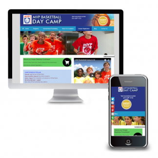
Read More - MVP Basketball CampThe Challenge MVP Basketball Camp’s website was full of great information, including details on upcoming fundraising events, camp registration and more. Unfortunately, the information was not necessarily easy to access. Nor did their site leverage web-based assets such as subscriber opt-ins and online registration. The website was not mobile-friendly making it hard for visitors using phones and tablets to access information as well as negatively impacting search engine placement. The…
Read More - Email Marketing StrategyThe Challenge A large, nonprofit was using MailChimp as their Email Service Provider (ESP) but they had no agency-wide email marketing strategy. They were concerned that their account would be canceled for not adhering to list management protocols. They had multiple users across various departments with varying levels of training on how to build and manage their lists. Some users imported emails into fresh lists for each campaign. Others manually added users…
Read More - Kaja Gam Interior Architecture & DesignThe Challenge Kaja Gam Interior Architecture & Design had an elegantly designed website but content management system was difficult to work with. What should have been a highlight of the site – Kaja’s portfolio – was limited to eight photos. And since the portfolio did not support the addition of text search engine optimization was significantly impaired. An email archive was added to the website but created in such a…
Read More - ColumbiaDoctors Of The Hudson ValleyThe Challenge ColumbiaDoctors of the Hudson Valley, with offices in Suffern and Monroe, needed a website that would appeal to seniors, the practice’s primary patient load, with a younger demographic, an area in which they hoped to grow. In collaboration with DesignWorks NY, CoCommunications and MarketingWorks NY we provided a cross-discipline approach that addressed the variety of needs on this project. Solutions We built a comprehensive strategy integrating the doctors’ expertise and…
Read More
