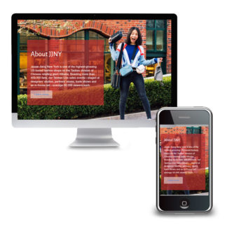
Visit JJNY.us The Challenge Jessie Jiang New York needed a portal to attract premium American brands to their Chinese shop on Alibaba. It needed to be slick and engaging, but fast loading for visitors who would mostly be accessing the site on their phones. The client found a paid theme that they really liked but had trouble converting the demo site to their content. The Solution We eliminated the slow-load times and glitches caused by the theme slider by recreating the visual aspects of the slider using CSS animation. We built a scalable video library using categories and simple thumbnail links which provided the added benefit of reducing page load time. The final result is an attractive, interactive website with fast-loading pages to allow visitors to focus on the content not the technology. Key Successes and What You Can Learn A prebuilt theme is a good shortcut – if you…
Read More
Tag Archives: WordPress
Broadway Mall Association
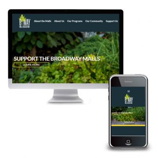
Visit BroadwayMall.org The Challenge Broadway Mall Association had a WordPress website that they liked. A few technical and style issues, however, kept them from loving it. The home page slideshow was an integral part of their communication and design but was difficult to update. The widgets on the home page were attractive and quickly took visitors to key areas of the website. The photos, however, did not line up perfectly with the green text boxes and looked sloppy. Other pesky problems included: the SSL not being applied correctly resulting in the site showing as “unsecure” inconsistencies in styles and the mobile layout The Solution A checkup was all that was necessary to get the website humming again. The home page slider was created using a very sophisticated plugin that offered a multitude of professional-level settings. It was far more than what was needed. We replaced it with a plugin that…
Read More
Michael Stiller
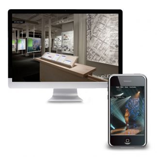
Visit MichaelStiller.com The Challenge The team at upLIGHT had a simple and elegant looking website. They still liked the design aesthetic even though the site had been designed a few years back. But the site was built without a Content Management System (CMS) and as a result, adding new projects to their portfolio required hiring a professional. Because of this updates to the website were often pushed to the back burner. The Solution They called Westchester Marketing Cafe to make some basic updates on the website. Rather than focusing on just making the changes, however, we were able to provide a longer-term value. We migrated the entire site to a CMS, in this case, WordPress, that would allow the client to make changes themselves. The budget was kept in check by using many of the existing design elements and the content that was still current. We were able to improve…
Read More
Sound Earth
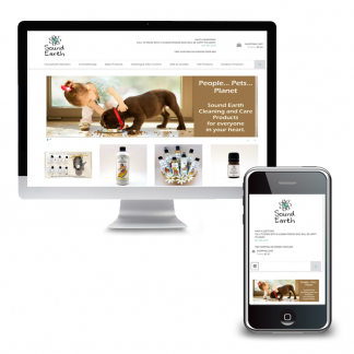
Visit SoundEarth.com The Challenge Sound Earth’s website was nearly 10 years old and its age was showing. As they moved into their busy season, and when what looked like a promising solution didn’t pan out, they needed an alternative fast. The small e-commerce business needed an online shopping experience that was easy for customers but also simple to manage on the backend. They didn’t need a lot of bells and whistles but automatic shipping calculation with label printing was a must, as was a responsive design. Customer accounts that would remember past orders was also on the wish list. Solutions By using WordPress, WooCommerce and a pre-built theme we were able to get things rolling in short order. Simple style edits made the site match the Sound Earth brand. Many “wish list” items were included out of the gate as well; recommended products, coupons and free shipping for larger purchases. Within…
Read More
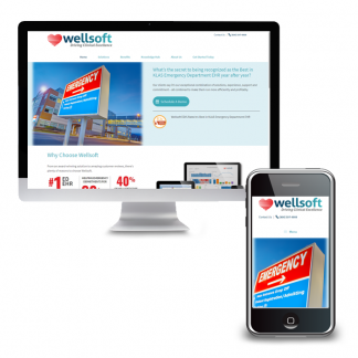
Wellsoft
The Challenge Wellsoft.com was built on a relatively unknown Content Management System which was difficult to add new content and attract new prospects. With limited lead generation and lead capture forms it was challenging to identify and follow up with prospects. The non-mobile-friendly framework negatively impacted the site’s placement in the search engines and made it harder for visitors on mobile devices to engage with the site. Solutions We focused on three fundamental elements for the new website: messaging, lead capture and mobile-friendliness. The messaging was written, and pages organized, to address concerns specific to various decision-makers. Within the messaging was a call-to-action encouraging readers to request a demo, which then captured contact information allowing the sales team to follow up. A mobile-friendly website was a must-have for search engine optimization as well as site usability, especially given the high number of international visitors who were more likely to be visiting…
Read More
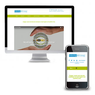
Balancing Life’s Issues
The Challenge The Balancing Life’s Issues (BLI) website had become overgrown with too much copy and an on-boarding process that hadn’t been reevaluated in years. The BLI team needed to simplify and streamline the website to include only essential elements. Solutions The home page was designed to feature a company video that had been filmed previously but had no home on the old website. Contact information for staff was laid out in an easy-to-scan table that works just as well on a phone as it does on a desktop. Information for new trainers was consolidated into a single page with step-by-step instructions and all necessary documents readily available for download. Key Successes Focus On ActionGetting rid of extraneous pages and content brought readers straight to Calls To Action and simplified site maintenance. Good HousekeepingAn issue with the hosting account for a secondary website provided an opportunity to merge the external…
Read More
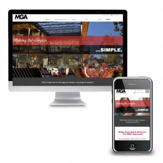
Miller Grossbard Advisors
Visit MGALLP.com The Challenge Miller Grossbard Advisors, LLP (MGA) had been serving the Houston-area for decades. Their clients had grown to rely on them for much more than tax and accounting however. MGA needed their website to reflect not just their full range of advisory services but their unique personality. An ordinary website would not do. Solutions We worked with MGA to create a simple website with a very modern feel that reflected their mission of making the complex simple. Taking inspiration from the advertising sector, we used great visuals to help tell their story. Key Successes Strong VisualsWith attention spans at a minimum and competition around every corner, standing out in the crowd is very difficult. We made this possible by using images, as well as words, to tell the story. Thought LeadershipMGA’s is full of innovative, forward-thinking professionals. With all that talent, they are committed to being thought…
Read More
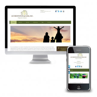
Accreditation Guru
The Challenge Three years after we merged Accreditation Guru’s old website and blog into a single platform, it was time to give the site a fresh look! The original design was fussy relative to the clean, pared-down aesthetic that had become popular. Solutions The website redesign built on the original style standards but focused on simplifying the look and the copy. This approach created consistency in branding between the old site and the new but eliminated distractions that could divert readers. Key Successes Building a new theme presented us with the opportunity to create a template for simplifying the creation of future landing pages. As Accreditation Guru expands its reach, this will allow for better tracking of paid marketing efforts. What You Can Learn Often a website redesign project, just like redesigning a room in your home, provides opportunities to address pesky problems. There may be a way to automate…
Read More
CoveCare Center
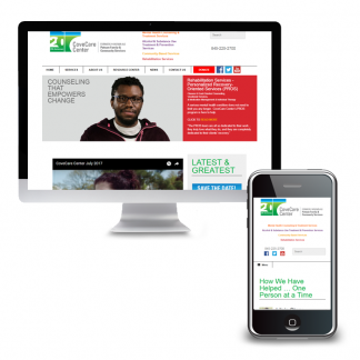
The Challenge CoveCare Center, formerly known as Putnam Family & Community Services, needed a new website as a part of their rebranding initiative. More than just a new logo, they needed a website that would be mobile-friendly to accommodate their many clients accessing the site solely on mobile devices. The new site would start with a deep pool of content and grow from there. This made it crucial to create a well-designed and flexible navigation structure. Top level pages would require fresh content regularly to encourage visitors to dive deeper into the website but not take up valuable staff time with fussy changes. Solutions We worked with CoveCare Center and their team from content strategy to site launch. Work started with content strategy development. We focused on identifying the needs of the target audiences and created the blueprint for the website. Using the content strategy we were able to determine…
Read More
Events To Remember
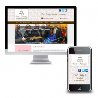
Visit EventsRemember.com The Challenge Events To Remember, a full-service event management agency, was growing. They added public relations to its list of services and were building on their reach with the nonprofit sector, working with development officers on large, gala-type events and fundraisers. Their site, however, was dated and because it lacked a content management system they were unable to easily update it. As a result, there was no mention of their public relations services nor any focused messaging for nonprofits. A blog had been created on Blogger but had long since languished as a separate, stand-alone site with a single link from the primary site to help visitors find it. Once there, the look and feel of the site did not match the ETR branding. Solutions We pulled together the main website and the blog and moved both into WordPress. This allowed staff to easily add new content and…
Read More
