View more presentations from Westchester Marketing Cafe, LLC on Slideshare.
Continue readingCategory Archives: Marketing
Website Usability: Website Navigation
Good site design and good navigational structure is all about your readers. And that’s just good marketing. This article will help you understand how to build a strong navigational structure for your website.
Continue readingWebsite Usability: Wayfinders To Help Users Find Their Way.
For effective online marketing SIMPLE is really the key.
Navigational and information design for websites tells us we need to present links and information clearly and with purpose. Your visitors should be able to navigation your site almost without thinking about it. The information should be easy to pick out from the page without studying the text.
Manage Your Email List
Turns out, on many lists, we don’t have the option to update our profile. We can either leave the old email address on the list or unsubscribe altogether. So as we phase out of the old emails, what do you think we’re doing on the lists that don’t give us any other option? Right, opting out… Here’s what to do so you don’t lose your valuable subscribers.
Continue readingTaming Of The Online Review
We received a very distressed call from a Yorktown business owner the other day. She had received a scathing online review – two actually – on CitySearch.com. She asked what we could do to “block the site”. In a word; NOTHING. But there are things you can do to tame bad customer reviews. How Online Review Sites Work The point of these sites is to allow consumers to post reviews of area businesses, giving other consumers the benefit of their experience. Happy customers can let others know about the great customer service they received, the great ambiance at your restaurant, etc. But, conversely, unhappy customers can rant about whatever they want and, yes, say things that aren’t true. Mitigating a Bad Review One bad review does not spell doom for your business, however. There are ways to lessen the impact of a bad review. Respond to the Criticism. As with most issues,…
Read More
Website Entry Pages: Your Website Is NOT Your Home Page
We are working with a Spa in lower Westchester that sells a lot of gift certificates on their website. We are overhauling the website including the all-important gift certificate page. In recently reviewing our progress we were averaging about 3 minutes a page – but spent 40 minutes going over the gift certificates page. Here’s why that time was well spent.
Continue readingContent Management System: How Do I Love Thee? Let Me Count The Ways.
Content Management Systems, aka CMS, are wonderful little creations that take your website from soap box derby to Indy 500. How? Let me count the ways. 1. A content management system allows you to update your website more FREE-ly; pun intended.
Continue readingOnline Marketing Budget Vs. Wish List
I am working with a client in Scarsdale to overhaul their website. But as often happens the wish list of features is bigger than the online marketing budget. So what do you do when this happens? You prioritize. And implement some tactical online marketing solutions. Here are some of the issues and how we decided to tackle them.
Continue readingWeb Design Form Vs. Function
The classic example of form vs. function; the quintessential design dilemma. How do you present art for sale in an elegant manner but keep your viewer’s needs in mind?
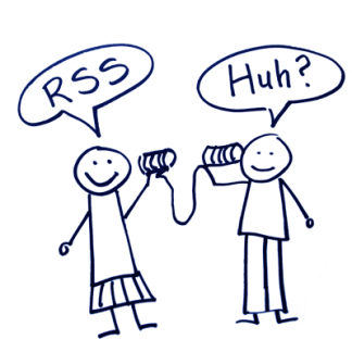
Continue readingWhat Is RSS; Translation, Please?!
The idea is to allow readers to get my relevant, useful content in a manner that is comfortable for THEM.
Continue reading


