Jean and Louis Dreyfus Foundation

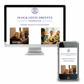
Visit JLDreyfus.org The Project The mission of the Jean and Louis Dreyfus Foundation is to enhance the quality of life of New Yorkers, particularly the aging and the disadvantaged. Their website did not convey the sophistication of the foundation or the organizations they fund. The main objectives of this project were to: 1. update the site with a simple but aesthetically pleasing way to showcase the programs supported by the foundation and 2. create an online grant application process that would simplify managing the hundreds of submissions during the two annual application periods. Key Successes The archive of grant recipients is easy to maintain using WordPress’s blogging functionality. Four posts – one for each program area – are created each year. The WordPress loop “automagically” places a link to the posts in the archive list. As a bonus, the most recent grant recipients show in full at the top of the…
Read More

Continue reading

Service Program for Older People (SPOP)

Visit SPOP.org About 20% of adults will experience a mental health disorder.  SPOP (Service Program for Older People) knows that therapy can be a highly effective pathway to emotional well-being, offering therapy for people ages 55 and older. But the website was hard to use, especially for older adults. The Process Discovery Through our Discovery process, we identified three key constituencies; Clients; Those who will be participating in programs or their families or caregivers Mental Health and Elder-care Professionals; those making referrals and those looking for continuing ed credits Donors Content Strategy The site was organized around the key messages of “Getting Support” (our first segment) and “Giving Care” (the second segment), and of course the background information and donor participation options. The home page features the organization’s new video to introduce SPOP to new clients and potential new referral partners. Below that is a section used for important announcements and…
Read More

Continue reading

The Gift Of Grab; Writing Website Copy For Your Home Page

When writing copy for your website it has to be attention-grabbing. You have about 15 seconds to engage your readers. That’s it. If they decide your content isn’t what they are looking for they will move on and not look back. Knowing how small your window is, how do you hook them and entice them to read more? Make Your Message Clear Often we try to be clever. Don’t. Keep it simple and get to the point quickly. Do so in a way that will invite the right readers to the appropriate content based on their needs. Get past the impulse to shout “We’re the greatest!” We’ve all heard this and, really, what else would you say, “We’re expensive and our service is for the birds”? Speak directly to the customers’ needs. What keeps them up at night? How can you help them get some sleep? Examples Do: “Our widgets…
Read More

Continue reading

42 Ed Games

Visit 42EdGames.com The Challenge Building on his years of experience Ray Kimball was taking his pedagogy to higher education professionals across the country with a completely new endeavor – 42 Ed Games. He needed soup to nuts; branding, messaging, and a website that would showcase the fact that that game-based learning is FUN. Designing immersive, highly engaging games that enable students to successfully grasp difficult concepts was his jam; marketing, not so much. Solutions Our team worked with Ray to develop a deep understanding of his business and his target market. Based on that information we created Key Messages that he could use on his website, in collateral marketing material and in pitches with potential clients. The branding for 42 Ed Games needed to represent the same irreverence as the name, a nod to “Hitchhikers Guide to the Galaxy”. Using a quirky font, bold colors (drawn from Ray’s military experience)…
Read More

Continue reading

Mark Galezo and Associates

Visit MarkGalezo.com The Challenge Mark Galezo, of Mark Galezo and Associates, reached out with questions about his website; he couldn’t figure out why he was not getting any traffic to his website. He had worked with a couple of other vendors but did not feel he had a clear picture of what they had done or where he stood. Nor did he feel he had a trusted resource to look into these issues on his behalf. With no information beyond what Mark was able to share over the phone, we needed to do more digging to find out what was happening before we could make recommendations for improvement. Solutions Based on our initial conversation, we recommended starting with a Marketing Audit. This would allow us to get in “under the hood” and do a thorough assessment of the website’s front and back ends, as well as his Google and social…
Read More

Continue reading

Launch Boutique

Visit – and shop – LaunchBoutique.com The Challenge Opening an online and brick-and-mortar store during a pandemic is not for the faint of heart! The client had a vision, however, and boldly moved forward. We needed to create an ecommerce website that would feature a limited number of products and categories to start but grow over time. The client would be adding products and maintaining inventory herself and wanted to make sure the interface would be simple to use but still have all the features she needed. Solutions WordPress and WooCommerce allowed us to create an attractive, easy-to-maintain online shop. Products can easily be listed as on sale via the dashboard. On the front-end, sale items are then featured on the home page and a dedicated sale page. Extensions allow for integrated shipping calculations, printing labels and coupons. Key Successes A written User Guide allows the client to confidently manage…
Read More

Continue reading

Stray H.E.L.P.

Visit StrayHELP.org The Challenge Stray H.E.L.P.’s website lacked clear, concise messaging. Every page appeared in the main menu making it difficult to discern relative priority of information. Additionally, a number of technical issues made the site difficult to update and maintain on the backend and plagued the user experience on the front end. Solutions An in-depth marketing questionnaire provided an opportunity to reflect on key services the organization provides. The information collected was used to create a content strategy that became the foundation of the new website content structure. Copyediting content brought key messaging to the fore and simplified the writing throughout the site. PDF forms were converted into online forms allowing the organization to move towards a paperless system and eliminated the need for volunteers to enter data into spreadsheets. Key Successes The adoption and foster application forms were extensive. By using conditional logic and reordering the fields, the…
Read More

Continue reading

PFS Foundation

Visit PFSFoundation.org The Challenge The PFS Foundation’s new website had been stalled for a while and communication with their web developer was sporadic. We were able to get the site launched but the work was not done! Content needed to be translated into multiple languages, and “wish list” features, such a a Patient Quilt of letters from PFS patients and family could be shared, were yet to be included. Solutions The first order of business was simplifying the overly-engineered WordPress website. We were able to remove much of the custom-coding that was preventing staff from being able to update content. With the initial work done, we were able to implement a “phase one” launch, making critical information available to readers right away. Subsequent phases included adding additional languages as translations become available. The site is now available in Spanish, Chinese, Russian, and Hindi. A “Patient Quilt” of letters from patients…
Read More

Continue reading

Mianus River Gorge

Visit Mianus.org The Challenge Mianus River Gorge is a private, not-for-profit nature preserve and conservation organization; but you wouldn’t know it from their old website. The website mainly focused on the hiking trails and only a subset of the diverse programs and research being done. A previous malware infection left the site difficult to update. As a result, much of the content was old and the look and feel were dated. Solutions Using bold images and simple copy we put the organization’s mission center stage. Program areas showcase the research and conservation work of the organization from the site navigation. A content strategy, based on program areas, keeps the site well organized and provides a structure for new content to be added over time. Key Successes Photos taken at the Gorge add significant visual impact and highlight the beauty of the Preserve. The new page structure – to say nothing…
Read More

Continue reading

Support Connection v2

Visit SupportConnection.org The Challenge Westchester Marketing Cafe redesigned the Support Connection website over four years ago and while the page structure stood the test of time, the site was looking a bit dated. Online payments were also a challenge because the original theme did not play well with the payment gateway. As a result, online sponsorship payments and donations were problematic; a significant hurdle especially once COVID hit and virtually all events went online. We wanted to leave most of the current content intact. This meant we needed to update the look without reformating every page. Finally, essential features, such as site search, the support number, and a link to information about the new retail shop needed a more prominent place on the site. Solutions We began by creating a new theme that leveraged the technical improvements in WordPress since the last redesign. The new theme and limited use of…
Read More

Continue reading