 Well, what else would you expect us to say? But that doesn’t make it any less true; website design matters to the success of your site, the plethora of exceptions to the rule notwithstanding.
When visitors land on your site their first impression will greatly effect the amount of time they spend on that page and on your site. And if you look like you slapped the site together overnight, expect that visitors will see you as a fly-by-night operation – and keep their credit card or contact information to themselves.
So what goes into designing a website that invites people to stick around? Here are some simple guidelines you can use even if you are using a “website in a box” template.
- Present content – graphics, text, forms, etc. – clearly and with purpose
- Use wayfinders to provide “your are here” context
- Use graphics and graphic techniques to present information in useful ways
- Links & navigation menus should convey relative importance of each item
Clear and Purposeful Presentation of Content
Don’t include a lot of visual “noise” on your page. Visitors will give you only a few SECONDS of their time before moving on. Get them where they want to be quickly. If they don’t know where to do next – they’ll go somewhere else, as in not your site.
Wayfinders
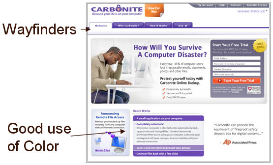
These are great little graphics or text styles that keep your visitors oriented within your site. Here’s a great example.

Graphics to Present Information In Useful Ways
Using the example above, shades of color and font color are used very effectively to break up the text and provide readers with easy to scan copy. It’s not color for color’s sake alone.
Relative Importance of Links
Think of sites you’ve visited that were little more than a long list of every link in no particular order. You didn’t know where to start or end. Avoid this by creating categories and placing pages under these categories. This will work even if you must use this list-as-navigation setup. Use font formatting or hyphens to indicate subpages.
A modest budget is no excuse for a poorly designed site. The most important aspect of design is considering the users needs and addressing them first. A well thought out site is like a gracious invitation to “come on in and stay a while.”