 We appreciate fancy, funky web stuff as much as the next guys and gals but for effective online marketing, SIMPLE is really the key. That means website usability.Part of strong website usability is effective navigational and information design. In other words, we need to present links and information clearly and with purpose. Your visitors should be able to navigation your site almost without thinking about it. The information should be easy to pick out from the page without studying the text.
One of the easiest tricks we can think of to help in this endeavor is to use wayfinders. These help your visitors navigate not just the site, but individual pages, to get the most out of your website.
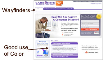
Wayfinders are like the big red arrows on the mall directory; they provide “your are here” context. Color, icons and typography can all be employed to present information in useful ways. Here are a couple of examples.
The Good:

Carbonite provides a very clean layout with very distinct wayfinders to help us navigate. The tabs at the top of the page are simple and distinct through the use of both color and graphics. The bottom middle section uses color, icons and typography to highlight the information currently available as well as additional information accessible via list slider.
The Bad and Ugly:

This site has virtually no way to navigate beyond a comprehensive list of all pages using only text. Confusion ensues because there is no “you are here” guidance, nor is there any context for visitors to discern the highly relevant content from the less relevant.
While there is a lot of color it does not aide in legibility or navigation. The graphics do not support the information in a meaningful way. The typography does not help the reader quickly scan the information.
Wayfinders don’t need to be difficult. Simple h1 or h2 tags, bulleted lists with only most relevant content and relevant graphics, easily obtainable on stock image websites, can all be used to provide visitors with effective navigational context and meaningful information design.
Pingback: What Does A Website Cost? - Westchester Marketing Cafe, LLC