Visit StrayHELP.org
The Challenge
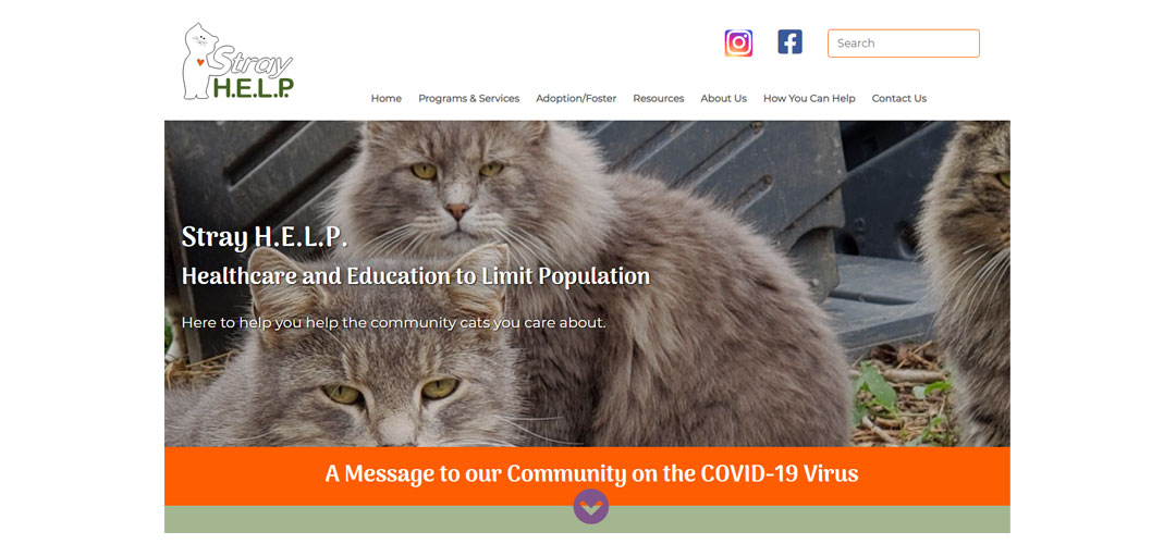
Stray H.E.L.P.’s website lacked clear, concise messaging. Every page appeared in the main menu making it difficult to discern relative priority of information.
Additionally, a number of technical issues made the site difficult to update and maintain on the backend and plagued the user experience on the front end.
Solutions
An in-depth marketing questionnaire provided an opportunity to reflect on key services the organization provides. The information collected was used to create a content strategy that became the foundation of the new website content structure.
Copyediting content brought key messaging to the fore and simplified the writing throughout the site.
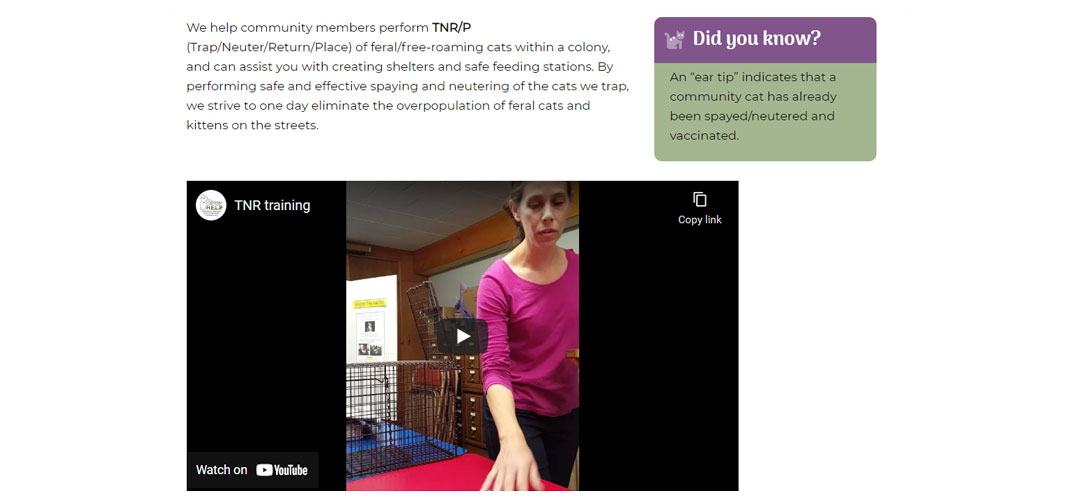
PDF forms were converted into online forms allowing the organization to move towards a paperless system and eliminated the need for volunteers to enter data into spreadsheets.
Key Successes
The adoption and foster application forms were extensive. By using conditional logic and reordering the fields, the form was streamlined and simplified making it less onerous to complete.
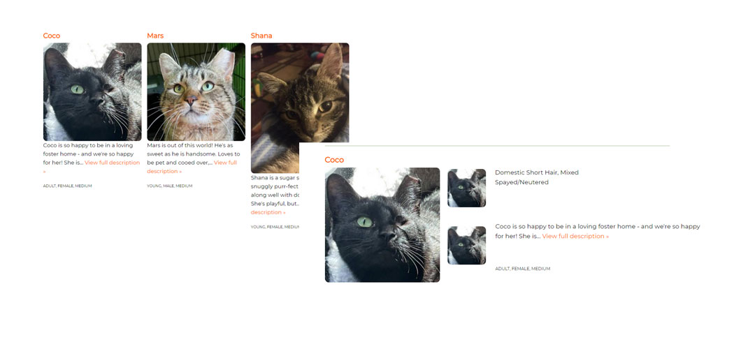
Custom styles applied to the Petfinder widgets accomplished two things:
- The widgets matched the overall branding of the organization.
- Made more effective use of space on the page.
What Can You Learn?
Taking the time to work with a professional to clarify and articulate key talking points and messaging can make the difference between a website that works for you and one that can work against you.
What The Client Had To Say

For the better part of a year we had been working with another agency that “specialized” in ecommerce websites. Technical issues continued to crop up and we were forced to repeatedly push back the date for our website relaunch. I was losing money at the same time I was spending hours focusing on the website instead of running my business!
I spoke with Jann to share my frustration. She immediately recognized the urgency of the situation with the holiday season fast approaching. It was a tremendous relief to have WMC tackle the technical elements of the shop so I could focus on the product side.
I’m now heading into our busiest season with a beautiful new website that functions better than I had even hoped!


