The Challenge
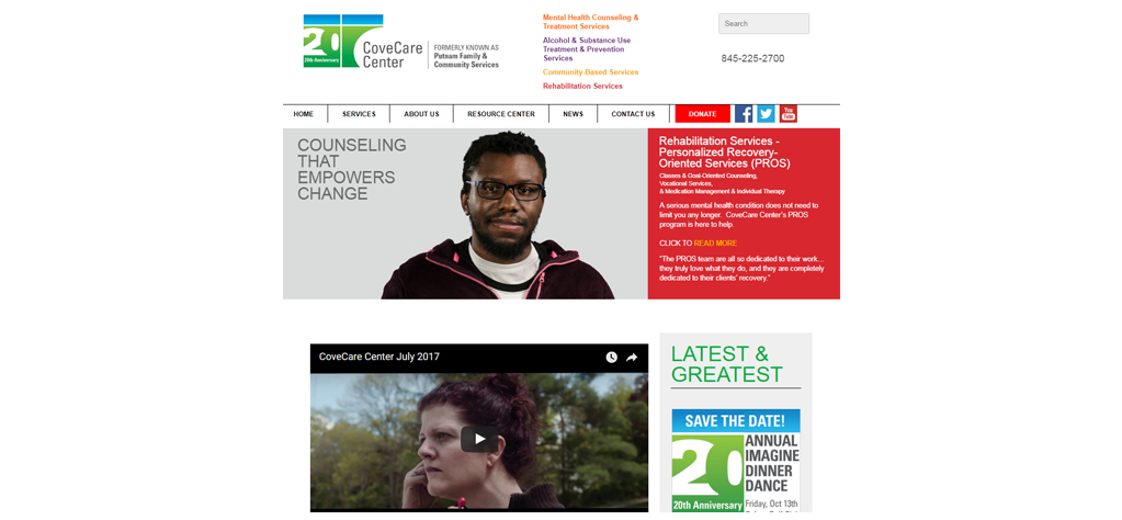
CoveCare Center, formerly known as Putnam Family & Community Services, needed a new website as a part of their rebranding initiative.
More than just a new logo, they needed a website that would be mobile-friendly to accommodate their many clients accessing the site solely on mobile devices.
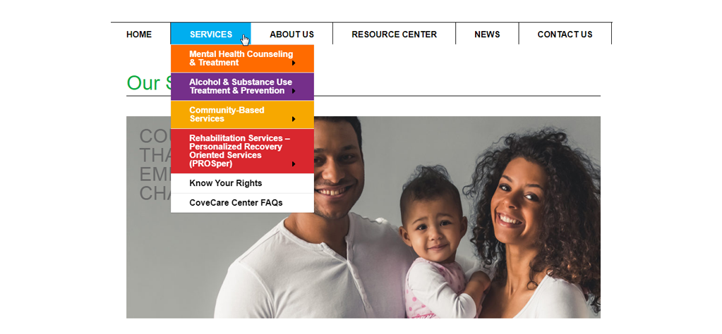
The new site would start with a deep pool of content and grow from there. This made it crucial to create a well-designed and flexible navigation structure.
Top level pages would require fresh content regularly to encourage visitors to dive deeper into the website but not take up valuable staff time with fussy changes.
Solutions
We worked with CoveCare Center and their team from content strategy to site launch.
Work started with content strategy development. We focused on identifying the needs of the target audiences and created the blueprint for the website. Using the content strategy we were able to determine what information would be added to the website, what form it would take, and how it would be organized.
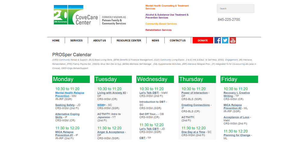
We developed custom page templates for each service area. Each template allowed staff to add sidebar content specific to each service area, helping readers access important information.
Key Successes
Color-coded content
Distinguishing between services areas was essential for clearly communicating CCC’s expertise and reinforcing the “accessibility” aspect of their brand positioning. Color-coded content became the means for creating “wayfinders” for visitors as they dove deeper into the website. Much like a map of an amusement park provides a sense of where one is in the grand scheme of things, this use of color became our means to provide a similar sense of location.
Content strategy
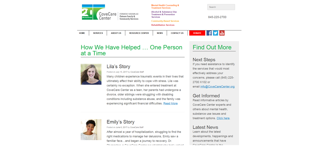
Rather than limiting ourselves to static pages or using an all-encompassing blog (and risk creating “grandmas attic” where good information goes to hide) we took the best of both worlds. We leveraged a blog to create categories into which new articles could be organized. Pages were created that would update if a new article was added to the appropriate category. Staff need only publish a new article and WordPress does all the heavy lifting.
What You Can Learn
Put yourself in your readers’ shoes
Sticking with our amusement park metaphor, some people will come and start from the entrance (your home page) and work their way through methodically. Others will head straight for the back and work their way forward. Still others will hopscotch around looking for the most interesting bits – based on their interest.
All will want to know where they are at all times and how to move forward, backward or sideways. Does your site let them do that? If not, contact us to see how we can help.


